Monday, May 3, 2010

Update on Speech info...

I had changed my speech after the first class but did not upload my new information...The First Promotional Message on the Edison Phonograph

_ Who is speaking? Len Spencer

_ Why was/is the speech important to society? The speech was important to society because it was the first machine ever invented that could record and replay anything. Speeches, musics, plays and other forms of information and entertainment could be heard worldwide and by anyone.

_ Why do you feel in is important or interesting? The speech is interesting because it is the first time that people could stay in their homes and still experience entertainment that was coming from some sort of machine. They did not have to have a live band playing and they did not have to provide the entertainment.

_ What is the emotion, mood, tone, personality, feeling of the speech? It has a classic feeling and is promotional yet it is modern in the sense that it is a new invention for the time period.

_ What is intonation, emphasis, what is loud, stressed, or soft. Where are there pauses... The is filled with confidence and makes the listener believe every word. He puts emphasis on certain words to get the point across. There are not very many soft words in the speech which helps with the promotional aspect.

_ What do you FEEL should be loud or soft, long pause or ruhed? "the great wizard of the new world, My voice is the clearest, smoothest and most natural, I am a genuine Edison phonograph, Ask the dealer." are all emphasized and show feel loud or paused.

_ Is there a call to action? When listening to it what are key/emphasized words?
"the great wizard of the new world, My voice is the clearest, smoothest and most natural, I am a genuine Edison phonograph, Ask the dealer." Also I want to stress how he always says I am and I can

_ How does it make you feel? This speech gives me a classic yet modern feeling.

_ How do imagine that the audience felt? They feel inspired and in awe that this is a machine talking.

_ Could there be another interpretation of the speech? It could be thought of as playful and funny because of how he says his words and that he is a man talking as a machine.

Journal 14

What inspired me the most this semester? That is such a hard question to answer because there have been many different designers, artists, and articles that have inspired me. Watching all of the videos on TED have helped me learn a lot about designing and what other designers do to solve their problems. At times it is confusing though because one person will say something that helps them while the other will completely disagree with it.

I think the project that inspired me the most was this last one. The speech project made me pick something that had a history behind it and had been a part of a large impact on others lives. The phonograph was a major invention at the time and had changed the way many people lived. Before it there was no way that someone could be recorded and played over and over again. I picked the speech based on those reasons and knew that I wouldn't mind listening to it over and over again. The research that was put into creating a motion of the speech also inspired me. Browsing through youtube trying to find type animations was very beneficial. There are many of them that use the same technique and do not very much in their transitions. My goal was to create a motion that was consistent but used transitions that were unique and fit with the overall tone.

I learned a lot while working on project 4 and do believe that it was because we had to do so much research on other designers and motions. If I really do want to become a designer I have to first find the concept, mood, and tone that I want to depict. I have to stick with it and make it work. Their work inspired me and I realized that if I really do want to become a designer I need to push myself harder. That is what I did for the "cursed" speech.

Tuesday, April 27, 2010

On Laws that Choke Creativity

Larry Lessig quotes and gives information on how laws are holding us back as designers. Most significant thing to recognize is that the internet is recreating the read write Suza was talking about. Digital technology can help revive what he had talked to congress about. We are able to celebrate people and for the love of what they are doing and not just because they have to do it. As designers we are able to recreate and mix things together to make something that we want.

People taking and recreating to say something that they want to get across. He does not focus on people "stealing" songs or images but using those things to advance our creativity and speak. He says it is what we are and how we think.

Now the architecture of copyright thinks that we are stealing and copying. There is a growing extrimism with the law and use of the technology's. The economy of influence and policy makers will not understand and the solution is a private solution to legalize what it is like to be young again. There need to be two changes, artists and creators embrace the idea that their work be made available more freely and the business that are building out the read write culture to enable it. That way the content of free culture can grow.

Tuesday, April 20, 2010

Journal 12

Paula Scher stood out to me the most out of the three designers that I watched. She said that after 34 years she still gets excited once she finally grasps her thought and then treats the type as a sculpture. She did a lot of work for Shakespeare in the Park and took a different spin on the idea. A European designer said that she was the first one to create an American Shakespeare poster.

One thing that really surprised me was that she said she operates on instincts. She will try to make an idea one or two times and if she is not happy with it, she said that it can't be done. We are taught to make many variations of the design and refine, refine, refine. Her work looks great but part of me wants to think that it could be even better if she would do my process. I know that my stuff changes drastically from the beginning to the final product.

David Carson gives many important tips but the thing that really hit me and I though related to the Speech in Motion project was, "the starting point is interpreting something, don't try to make it look pretty, try to understand what you just read." This relates to nearly everything we have to do as a graphic designer. What is the point in making a great poster that is beautiful and eye catching if it has nothing to do with the article, group, or company?

Another point that he made dealt with how everything we do now is on the computer. He said that he would not want to work for or with someone that did not allow him to put his personality into the piece he was creating.

The last designer I watched was Sagmeister. He had a very different view and it was almost depressing and not as inspiring but this could just be because of his views. At the end of the interview he said that you have to live in the now, keeping a diary supports personal development, complaining is silly, dreams are meaningless, and that everyone thinks they are liked. The last couple seem very negative and I like to keep a positive view on life so maybe that is what struck me wrong.

I do think he made a strong point when he says that worrying solves nothing. Seeing that my external hard drive crashed on me a couple days ago and it is almost the end of the year, I was freaking out. I figured out that by doing so, I just cause myself more stress and I do not need that. He also said that he has to "make himself jump over the wall" and push himself to the limits or towards something he would be afraid to try. I think I am going to try to start trying this approach and see what happens to my work...

Experimentation with After Effects...

So this is a little messy but I am just trying to get the hang of working with the camera...Still having some trouble figuring it out and am looking for advice to make it look smoother!


Sunday, April 18, 2010

Journal 11

Debbie Millman the President of the design divison of an international design consultancy, Sterling Brands. She has been there for fourteen years and in that time she has worked on the redesign of global brands for Pepsi, Procter & Gamble, Campbell’s, Colgate, Hershey and Hasbro. Debbie is President of the AIGA, the professional association for design.

Design Matters is a weekly talk radio show that is provided on the internet. Debbie Millman is the one in charge and she has done many interviews with designers such as Stephen Sagmeister, Chipp Kid, Jakob Trollback and many others.

I choose to listen to the interview between Debbie and Tim Brown, the CEO of IDEO. He speaks regularly on the value of design thinking and innovation to business and design audiences around the world. The interview begins by Tim talking about how he ended up getting into industrial design and he said that LEGO is one of the reasons he got into design. You learn by making and are able to explore as a yound child. He said that IDEO began as more of a traditional company and they have grown a lot. Even though they have grown, they have taken design thinking and applied it in different ways without being managment consultants. When they were working with Amtrak they questioned them and gave them an expierence strategy to help them think about more then just the seats people were going to be sitting in but rather the journy.

Journal 10

The GOOD website was very informational and helped inspire me a lot. A lot of the videos looked familiar and even though I thought they were very helpful it was kinda hard to put them with the motion we are creating. They were basically info-graphics for the most part and with those the content is more important to recognize the design. The differences that I did see between the info-graphics videos and the type based ones was the transitions that they went through from scene to scene The typographic videos demonstrated the importance of using imagery when necessary and how it related to the words in a cleaner and smoother transition. The info-graphics were very fast and choppy in many parts.

Journal 9

After watching video after video on the server and youtube I have found that many of them look the same. When viewing them without music or words the first round, there were only a couple that actually caught my attention. The motions that did not have much variety or hierarchy in them were boring without sound and I found it difficult to read them and stay interested. Adding sound to the animations changed them completely. Those that were already eye catching and attention grabbing were amazing while those that were boring became tolerable but still not too interesting to watch.

The Suberbad video was funny to watch and it sets the mood for the movie. It is so simple and it is amazing how much something can be described when only a silhouette is used. The two main characters are the ones dancing and the entire introduction does a great job of setting the mood for the movie.

The Casino Royle intro has been used a great example in one of my other classes. The very first scene when a gun shot is fired through the tunnel and blood drops down from the top of the screen is just so eye catching and memorable. The whole animation flows well and relates to the movie. The viewer is interested in seeing what is going to happen next as the main character fights with people. The end of it is also very interesting because the man is covered and created into a silhouette and tying it all together.

Spiderman 2 has an eye catching opening. It begins with comic book pages flipping fast to reveal the maker. It makes the viewer want to know what is going to happen and what are the comics about and how do they relate? The use of diagonal lines that are constantly moving and creating shapes and transparency's is interesting. The viewer does not want to look away because they do not know what is going to be shown next and don't want to miss it since it will soon be swept away by the other lines. The music plays along with the graphics very well and the suspension grows towards the end. The scale throughout it is pretty much constant with the exception of the title and the production company.

Monday, April 5, 2010

Address to France

General John J Pershing

"Three thousand miles from home, an American army is fighting for you. Everything you hold worthwhile is at stake. Only the hardest blows can win against the enemy we are fighting. Invoking the spirit of our forefathers, the army asks your unshrinking support, to the end that the high ideals for which America stands may endure upon the earth."

Importance: This is a speech given by John J. Pershing about Americans fighting in France in World War I. The soldiers need support.

Tone: Serious, meaningful, inspiration, dedication, support

3000 miles from home, fighting for you, at stake, fighting, forefathers, high ideals for which America stands

3000 miles loud, you should be paused, stake should be loud, forefathers paused, high ideals paused

It inspires me and informs. It gives me a sense of pride for America and is patriotic.

The audience was probably inspired by it and went out to celebrate the army and show support for the troops.

John Pershing was born on September 13th, 1860 in Laclede, Missouri. He spent some time as a school teacher at Prairie Mound. In September 1891, Pershing became Professor of Military Science and Tactics at the University of Nebraska. In 1906, he was promoted to Brigadier General. On April 6th, 1917, America declared war on Germany. In 1921, Pershing became the US Army Chief of Staff. In 1924, aged 64, Pershing retired from active duty. Prior to this retirement, Congress had awarded him the title 'General of the Armies'. In 1931, his autobiography 'My Experience of War' was published. It won a Pulitzer Prize for history in the following year.

Sunday, April 4, 2010

Journal 8

Designing Under the Influence
The article raises the question "Is anything I create as a designer truly my own/ purely unique to me?"

The brain works in mysterious ways and holds so many different memories. According to Michael Bierut, designs which we just pass on the street without taking a double look are stored in our minds. When we design we could be copying something that at once caught our eye.

It is important to know about past and current designers and their styles. We are still young in design and are trying to create a style of our own that is unique. It is hard to do this and not be accused of copying someone else's work, instead we should look to them for inspiration.

I am not sure that I could say that i have created something that was purely unique to me. I am trying to experiment and see what I can create and what style I am good at. With all of our exercises in type and graphics I feel that we are encouraged to branch out and try different ideas. If we are going to far or too crazy we tone it down and can create something.

Alternatives for Futura:

One possibility would be Gill Sans or Rotis Sans. They are similar in the characteritics. Or Frutiger could be used because it has sharp edges, a stem structure close to Futura's and large circular bowls.

Monday, March 29, 2010

Journal 7

Spring break was full of recovering from sickness and working on homework. I was able to get out of the house for one day and go to downtown St. Charles and walk around Main St. I love going down there because it is right next to the river and full of little family owned shops. The roads are cobble stoned and the atmosphere has a small town feel.
Here are a couple of the pictures that I took. Most of the signs had an old feeling to them and the last picture is of a poster I saw. I thought it was hideous and decided to take a picture for a bad example.

Monday, March 22, 2010

Journal 6


Sean Adams - I thought it was interesting what he thinks about design and I continue to think more about design as solving problems as well. The most influential piece of design for him was the Declaration of Independence, which I was not expecting. He said that he thought it was the biggest accomplishment to design a government and after he put it this way I began to understand it more.

Paula Scher startled me when she said that she did not have a single example of design that would be the most inspiring. She is interested in many different types of design and likes thinking of the relationship of time vs. designer and how problems are solved differently according to time. Her ideas conflicted with Sean Adams in the fact that one of her main points was that design doesn't solve problems. Instead, think of ways to do things better.

Steven Heller made me laugh when he said that the Michelin Man is the most inspiring because it is a hugely successful logo/spokesperson. I definitely do not see the Michelin Man being the most succesful logo so am surprised he said this. There are many other logos such as Apple, McDonalds, NBC, and others that are able to be recognized around the nation and some world wide.

For Erik Spiekermann the alphabet is most inspiring. Gutenberg invented the printing press and created the first typeface that was not just handwriting. It was the beginning of typefaces. -- like Meta. The alphabet is art.

Chipp Kidd said the most inspiring example of design is identity. He said that in order for a designer to not lose their passion they must take credit for their work and when we are recognized we get paid more. He also mentioned that designers need to take themselves seriously and you should be inspired by all of their surroundings.

Tuesday, March 9, 2010

Final process

From these, I minimized the layering and added pictures of sand and the ocean to the background. I changed around the color scheme to be more beach like and complement the color of the dates.


For the final version I got rid of the diagonal title and made all of the text black except for the dates.

Sunday, March 7, 2010

Process for Timeline

Sketches to begin with...


Originally I had planned to do a rotating pie chart to display both the image and type in an interactive way. After some experiementing with how it would rotate, I did not think it would be as strong as I had hoped. It would have been mostly image based with little type and that was not a good direction to go in.

I changed to a long composition that displayed the dates in a 3d manor. They are color coordinated to fit one of the 9 categories. The date is much larger and creates a sense of hierarchy with the contrast of small and large typefaces and the eye is moved down by the arrangement of dates.

Below are the first compositions that I came up with and one seemed to empty without a background which is why i added a texture in the other. The problem with the second is there is too much going on. I like the effect of layering and really wanted to play around with it but it begins to get difficult to read.

Monday, February 22, 2010

Journal 5

The videos from TED that I watched were really inspirational and heart warming. The one that I really enjoyed was A warm embrace that saves lives. People in third world countries are not able to afford incubators to save premature infant lives. They invented a sleeping bag like form that has a pocket in the back that holds hot wax packets that can be heated by warm water. Instead of spending hundreds of thousands of dollars on an incubator they are able to purchase the sleeping bag for $25 and reuse it. I can only hope that when I go out into the real world that I am able to help others with my designs and not just make things look pretty.

How Good is Good?

Some of the points that stood out most are how his views have changed from the beginning to; Help others, don't hurt anybody, and strive for happiness. I wonder what all happened to make him change his priorities around though.
I enjoyed all of the bold points that he made and how underneath each one was defined. Design can simplify our lifes, it can make the world a safer place, and design can make us raise money were the ones I related to most. Like I mentioned above, after watching the video and reading this article, I hope that my designs will make a difference.

Sunday, February 21, 2010

Final Product!

Professional-anxiety


Professional: of or for a professional person or his or her place of business or work:


Synonyms: able, acknowledged, adept, competent, efficient, experienced, expert, known, learned, licensed, polished, practiced, proficient, qualified, sharp, skillful, well-qualified


Anxiety: distress or uneasiness of mind caused by fear of danger or misfortune: earnest but tense desire.


Synonyms: fear, foreboding; worry, disquiet, eagerness

To suggest a sense of suspension

To suggest a sense of professionalism and jurisdiction

To suggest a sense of fear

To suggest a sense of mystery

To suggest a sense of high class

To suggest a sense of Ivy league class

To suggest a sense of unknown and turning on people


Saturday, February 20, 2010

Journal 4

Who is Bruce Mao? He is a well-known as a graphic designer and his innovative communication design. He is Chief Creative Officer of Bruce Mau Design, and was most noticed when he worked an award winning book with Rem Koolhass.


On his website bruce Mao outlines several mantras in which he believes contribute to the bettering of design. I choose #1.


1. Allow events to change you.
You have to be willing to grow. Growth is different from something that happens to you. You produce it. You live it. The prerequisites for growth: the openness to experience events and the willingness to be changed by them.


I picked number one because i feel that i do not step out of my comfort zone and experiment. I instead will stay around people and places that I am comfortable with and therefore not change. Last year I was afraid to change who I was and that I would lose sight of who I am. I realized that branching out and trying new things, within reason, can only help me grow as a person. I am going to continue to do so and hope for the best and that I will be inspired.

Sunday, February 14, 2010

Journal 3

1) Have a concept: If there is no message then what is its good existing? There has to be an idea and story behind the creation.

2) Communicate - don't decorate: the work needs to support the concept and if it is decorated the communication/main point will be lost.

3) Speak with one visual voice: all parts present in the design need to relate harmoniously to everything else and communicate the same message.

4) Use two typeface families maximum. Ok, maybe three: Chose the typefaces that support the concept and mood of the work. The type should not compete with the rest of the pieces but work in-sync with them all.

5) Use the one-two punch!: focus the viewers attention on one thing and through that, it leads them on to the next or rest of the piece.

6) Pick colors on purpose: Color is very important and catches the viewers attention and sets the mood for the piece. It can be used to affect hierarchy and legibility.

7) If you can do it with less, the do it: "less is more" if there is too much on a piece then the audience does not know where they are supposed to look and it gets confusing and frustrating.

8) Negative space is magical - create it, don't just fill it up!: Having white space calls attention to content and gives the eye a resting place.

9) Treat the type as image, as though it's just as important: type needs to relate to everything in the design and not just be smacked onto the piece.

10) Type is only type when it's friendly: if the type chosen is not readable then what is its purpose? Chose a typeface that is legible and eye catching.

11) Be universal; remember that it's not about you: others have to be kept in mind when designing because if it only relates to you and know one else, the design fails.

12) Squish and separate: be rhythmic yet change the size, color, and weight of objects to create contrast.

13) Distribute light and dark like firecrackers and the rising sun: create a wide range of tone value.

14) Be decisive. Do it on purpose - or don't do it at all: if there is no purpose, why do it? Make something that supports the concept and if it doesn't get rid of it.

15) Measure with your eyes: design is visual:

16) Create images - don't scavenge: design needs to be unique and stand out. Stock photos are over used and we should not rely on what already exists.

17) Ignore fashion. Seriously: fashion changes everyday and if you create a design that has more of a meaning then it will have a longer lasting impression.

18) Move it! Static equals dull: a layout needs to create a sense of movement for the eye. If it is dull and flat, the viewer will just move on and become uninterested.

19) Look to history, but don't repeat it: we can be inspired by the past but should develop the ideas we get from it.

20) Symmetry is the ultimate evil: there is not much movement with symmetrical designs which leaves them boring.

Three most important rules:
1) Have a concept
2) Speak with one visual voice
3) Be decisive. Do it on purpose-or don't do it at all.

Without those three rules, there would be no design. Having a concept is definitely the most important because it is the beginning of what the design will communicate.

Three rules to improve:

1) If you can do it with less, then do it.
2) Treat the type as image, as though it's just as important.
3) Symmetry is the ultimate evil.

I feel that I always start out with way too much on a page. After the first critique I am able to get rid of most of the nonsense but I should pay more attention to what I am trying to communicate and only insert the necessary design elements. Then there is the type, which I have had trouble with in the past. It is not until the end of my design that I "plug" in my type elements. Avoiding symmetry is another thing that I need to improve on. I know that i've improved from the beginning of the year but some of my work still is too symmetrical.

There weren't really any rules that I thought should be ignored but if I have to pick three they would be the following:

1) Ignore fashion. Seriously
2) Create images-don't scavenge (I agree with this rule but I think it is okay to gather some of the materials which we do not have access to)
3) Measure with your eyes: design is visual.

Monday, February 1, 2010

Chipp Kidd and Step Mag

Chipp Kidd

Thomas Allen creates dioramas from pulp scifi novels for bookjackets and photographs them.


Smithsonian Q&A

He relaxed his turning point when he recognized the potential he had as a writer and ability to generate content and communicate it visually.


Unique Ideas depend on unique content

The challenge of a designer in trade publishing is to do something that’s an interesting design, but also has mass appeal.


The most challenging cover for him to design was that of the New Testament. He took a risk and used a controversal photographer who placed a dead mans face as the picture. No bookstores would carry it.


being an author made him more sympathetic to authors he designs for beause their work is assigned a visual identity.


Magazine covers strive to tell you everything and can’t tell you enough. Whereas, a book cover, if done right, suggests a sensibility, and is discrete. Book Cover design has become smarter making designers and publishers want challenging ideas.


Step Mag: John Gall art director at Vintage


Gall’s style is simple but elegant use of typography and quietly rebellious spirit. His covers play with the pereptions of the viewer by being subtle and compelling. Collage, photography, typography and art are all grist for the mill, yet no matter how varied the medium. A great book cover conveys the essence of the book in a unique and surprising way that pushes the design envelope a bit.


Sunday, January 31, 2010

Revised Concept

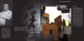
Concept Statement:  Cultured-anxiety

Cultured: enlightened, refined, cultivated; tilled.

Synonyms:

1. polished, sophisticated, elegant

Anxiety:

1.  distress or uneasiness of mind caused by fear of danger or misfortune: He felt anxiety about the possible loss of his job.

2.  earnest but tense desire; eagerness: He had a keen anxiety to succeed in his work.

3.  Psychiatry. a state of apprehension and psychic tension occurring in some forms of mental disorder.

Synonyms:

1. fear, foreboding; worry, disquiet


To suggest a sense of suspension

To suggest a sense of professionalism and jurisdication

To suggest a sense of fear

To suggest a sense of mystery

To suggest a sense of high class

To suggest a sense of Ivy league class

To suggest a sense of unknown and turning on people


Corey Tucker is in his mid early twenties and currently enrolled at a University. He is an outgoing individual who loves playing sports and watching thriller and action movies.  His mother who is a teacher and his father, a lawyer raised him with 3 siblings.  Ever since he was young, Corey had always loved hearing his father tell stories about the cases he was on.  Throughout high school he developed an interest in engineering but still enjoyed reading and hearing about crime scenes, politics, and court cases. 

Concept Poster

Wednesday, January 27, 2010

Mood Board Pics

Here are just some samples they are a little burry but I plan on getting some better ones.