Monday, February 22, 2010

Journal 5

The videos from TED that I watched were really inspirational and heart warming. The one that I really enjoyed was A warm embrace that saves lives. People in third world countries are not able to afford incubators to save premature infant lives. They invented a sleeping bag like form that has a pocket in the back that holds hot wax packets that can be heated by warm water. Instead of spending hundreds of thousands of dollars on an incubator they are able to purchase the sleeping bag for $25 and reuse it. I can only hope that when I go out into the real world that I am able to help others with my designs and not just make things look pretty.

How Good is Good?

Some of the points that stood out most are how his views have changed from the beginning to; Help others, don't hurt anybody, and strive for happiness. I wonder what all happened to make him change his priorities around though.
I enjoyed all of the bold points that he made and how underneath each one was defined. Design can simplify our lifes, it can make the world a safer place, and design can make us raise money were the ones I related to most. Like I mentioned above, after watching the video and reading this article, I hope that my designs will make a difference.

Sunday, February 21, 2010

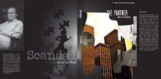
Final Product!

Professional-anxiety


Professional: of or for a professional person or his or her place of business or work:


Synonyms: able, acknowledged, adept, competent, efficient, experienced, expert, known, learned, licensed, polished, practiced, proficient, qualified, sharp, skillful, well-qualified


Anxiety: distress or uneasiness of mind caused by fear of danger or misfortune: earnest but tense desire.


Synonyms: fear, foreboding; worry, disquiet, eagerness

To suggest a sense of suspension

To suggest a sense of professionalism and jurisdiction

To suggest a sense of fear

To suggest a sense of mystery

To suggest a sense of high class

To suggest a sense of Ivy league class

To suggest a sense of unknown and turning on people

Saturday, February 20, 2010

Journal 4

Who is Bruce Mao? He is a well-known as a graphic designer and his innovative communication design. He is Chief Creative Officer of Bruce Mau Design, and was most noticed when he worked an award winning book with Rem Koolhass.


On his website bruce Mao outlines several mantras in which he believes contribute to the bettering of design. I choose #1.


1. Allow events to change you.
You have to be willing to grow. Growth is different from something that happens to you. You produce it. You live it. The prerequisites for growth: the openness to experience events and the willingness to be changed by them.


I picked number one because i feel that i do not step out of my comfort zone and experiment. I instead will stay around people and places that I am comfortable with and therefore not change. Last year I was afraid to change who I was and that I would lose sight of who I am. I realized that branching out and trying new things, within reason, can only help me grow as a person. I am going to continue to do so and hope for the best and that I will be inspired.

Sunday, February 14, 2010

Journal 3

1) Have a concept: If there is no message then what is its good existing? There has to be an idea and story behind the creation.

2) Communicate - don't decorate: the work needs to support the concept and if it is decorated the communication/main point will be lost.

3) Speak with one visual voice: all parts present in the design need to relate harmoniously to everything else and communicate the same message.

4) Use two typeface families maximum. Ok, maybe three: Chose the typefaces that support the concept and mood of the work. The type should not compete with the rest of the pieces but work in-sync with them all.

5) Use the one-two punch!: focus the viewers attention on one thing and through that, it leads them on to the next or rest of the piece.

6) Pick colors on purpose: Color is very important and catches the viewers attention and sets the mood for the piece. It can be used to affect hierarchy and legibility.

7) If you can do it with less, the do it: "less is more" if there is too much on a piece then the audience does not know where they are supposed to look and it gets confusing and frustrating.

8) Negative space is magical - create it, don't just fill it up!: Having white space calls attention to content and gives the eye a resting place.

9) Treat the type as image, as though it's just as important: type needs to relate to everything in the design and not just be smacked onto the piece.

10) Type is only type when it's friendly: if the type chosen is not readable then what is its purpose? Chose a typeface that is legible and eye catching.

11) Be universal; remember that it's not about you: others have to be kept in mind when designing because if it only relates to you and know one else, the design fails.

12) Squish and separate: be rhythmic yet change the size, color, and weight of objects to create contrast.

13) Distribute light and dark like firecrackers and the rising sun: create a wide range of tone value.

14) Be decisive. Do it on purpose - or don't do it at all: if there is no purpose, why do it? Make something that supports the concept and if it doesn't get rid of it.

15) Measure with your eyes: design is visual:

16) Create images - don't scavenge: design needs to be unique and stand out. Stock photos are over used and we should not rely on what already exists.

17) Ignore fashion. Seriously: fashion changes everyday and if you create a design that has more of a meaning then it will have a longer lasting impression.

18) Move it! Static equals dull: a layout needs to create a sense of movement for the eye. If it is dull and flat, the viewer will just move on and become uninterested.

19) Look to history, but don't repeat it: we can be inspired by the past but should develop the ideas we get from it.

20) Symmetry is the ultimate evil: there is not much movement with symmetrical designs which leaves them boring.

Three most important rules:
1) Have a concept
2) Speak with one visual voice
3) Be decisive. Do it on purpose-or don't do it at all.

Without those three rules, there would be no design. Having a concept is definitely the most important because it is the beginning of what the design will communicate.

Three rules to improve:

1) If you can do it with less, then do it.
2) Treat the type as image, as though it's just as important.
3) Symmetry is the ultimate evil.

I feel that I always start out with way too much on a page. After the first critique I am able to get rid of most of the nonsense but I should pay more attention to what I am trying to communicate and only insert the necessary design elements. Then there is the type, which I have had trouble with in the past. It is not until the end of my design that I "plug" in my type elements. Avoiding symmetry is another thing that I need to improve on. I know that i've improved from the beginning of the year but some of my work still is too symmetrical.

There weren't really any rules that I thought should be ignored but if I have to pick three they would be the following:

1) Ignore fashion. Seriously
2) Create images-don't scavenge (I agree with this rule but I think it is okay to gather some of the materials which we do not have access to)
3) Measure with your eyes: design is visual.

Monday, February 1, 2010

Chipp Kidd and Step Mag

Chipp Kidd

Thomas Allen creates dioramas from pulp scifi novels for bookjackets and photographs them.


Smithsonian Q&A

He relaxed his turning point when he recognized the potential he had as a writer and ability to generate content and communicate it visually.


Unique Ideas depend on unique content

The challenge of a designer in trade publishing is to do something that’s an interesting design, but also has mass appeal.


The most challenging cover for him to design was that of the New Testament. He took a risk and used a controversal photographer who placed a dead mans face as the picture. No bookstores would carry it.


being an author made him more sympathetic to authors he designs for beause their work is assigned a visual identity.


Magazine covers strive to tell you everything and can’t tell you enough. Whereas, a book cover, if done right, suggests a sensibility, and is discrete. Book Cover design has become smarter making designers and publishers want challenging ideas.


Step Mag: John Gall art director at Vintage


Gall’s style is simple but elegant use of typography and quietly rebellious spirit. His covers play with the pereptions of the viewer by being subtle and compelling. Collage, photography, typography and art are all grist for the mill, yet no matter how varied the medium. A great book cover conveys the essence of the book in a unique and surprising way that pushes the design envelope a bit.