As I read through the various articles about sorting data, I was most interested when I came to the pie charts. The quote at the very beginning had me interested, "The circle is the first perfect shape... The space speaks of potential - the tension between what is achieved and what could be achieve. From the circle, we derive ideals and focus, both the halo of saints, and the cross - haired target in gun sights" (Data Flow 6).
From that page, circles are used to represent everything from human deaths, talk shows, textures, and colors of flags around the world. Each layout uses the circle in a different way that relates to the topic it is referring to.
Shahee Ilyas uses the pie chart to create an international pie chart of flags. He reduces each countries flag to simply their colors and shows the proportion of the colors used on their flag as a pie chart. When all of the charts are put together it shows how similar some of the flags are to each other by the percentage of colors. He took a very complicated variety of national flags and simplified them to the extreme to create a visually appealing pie graph chart.
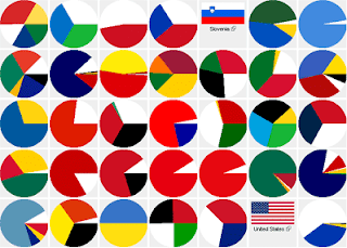 This is just an example I found on the internet which is similar to that of the book. The one in Data Flow does not have any whole flags but just the pie charts representing them.